by guest contributor Jane Raisch
The difficulties of printing Greek are something of a refrain amongst its earliest printers. “Anyone who criticizes me is quite unjust and ungrateful,” the acclaimed printer of the classics, Aldus Manutius, complained in the preface to his Herodotus, Hesiod, and Theognis (1496), “I would not wish them anything worse than that they too should one day print Greek texts.”[1] For Aldus and other printers in the incunabular period, printing Greek did indeed pose genuine, technical challenges. Unlike Latin, Greek is accented, not only above but also below the line, and determining the most efficient and cost-effective way to render its accents in movable-type was an ongoing problem. Additionally, the so-called “Greek humanist hand” popular in the late fifteenth century incorporated a number of complex ligatures, abbreviations, and flourishes which required cutting even more distinct pieces of type. And while Aldus’ Greek type design would ultimately become the standard, influencing the appearance of printed Greek for the next two centuries, exploring various experiments with Greek typography in the incunabular period (and the decades just after), especially the innovations of the Byzantine scholar, Janus Lascaris, reveals the dynamism and creativity that surrounded early attempts to reconstruct ancient Greek via print.
A few decades before Aldus and Janus Lascaris, the Cretan émigré and printer Demetrius Damilas addressed the challenges of printing Greek in the dedication to his edition of the Erotemata of Constantine Lascaris (1476), the first book to be printed entirely in Greek: “with difficulty I have found at last how Greek books might be printed too, not only in the composition of the letters which is sundry and complex in Greek, but especially in those places marked with accents, which is certainly a difficult business and it requires no little consideration.”[2] Before Damilas’ Erotemata, Greek text had been printed, but only as quotations or proper names within primarily Latin texts. The Lactantius of Sweynheym and Pannartz (1470) is perhaps the most famous example. These earliest attempts to print Greek, however, used noticeably reduced, sometimes non-existent, systems of Greek accents, making Damilas’ introduction of fully accented Greek type a crucial innovation. Nonetheless, printers after Damilas continued to experiment with and refine various strategies for typographically representing accented Greek on the printed page.
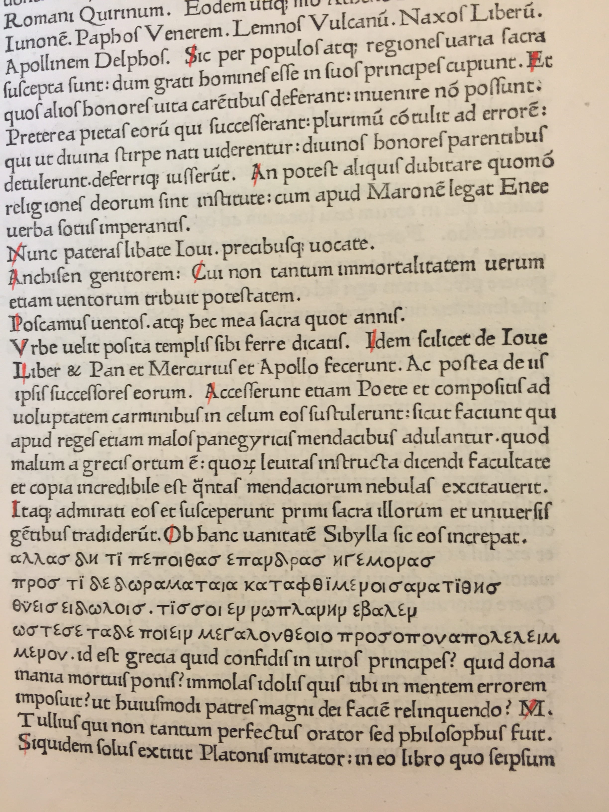
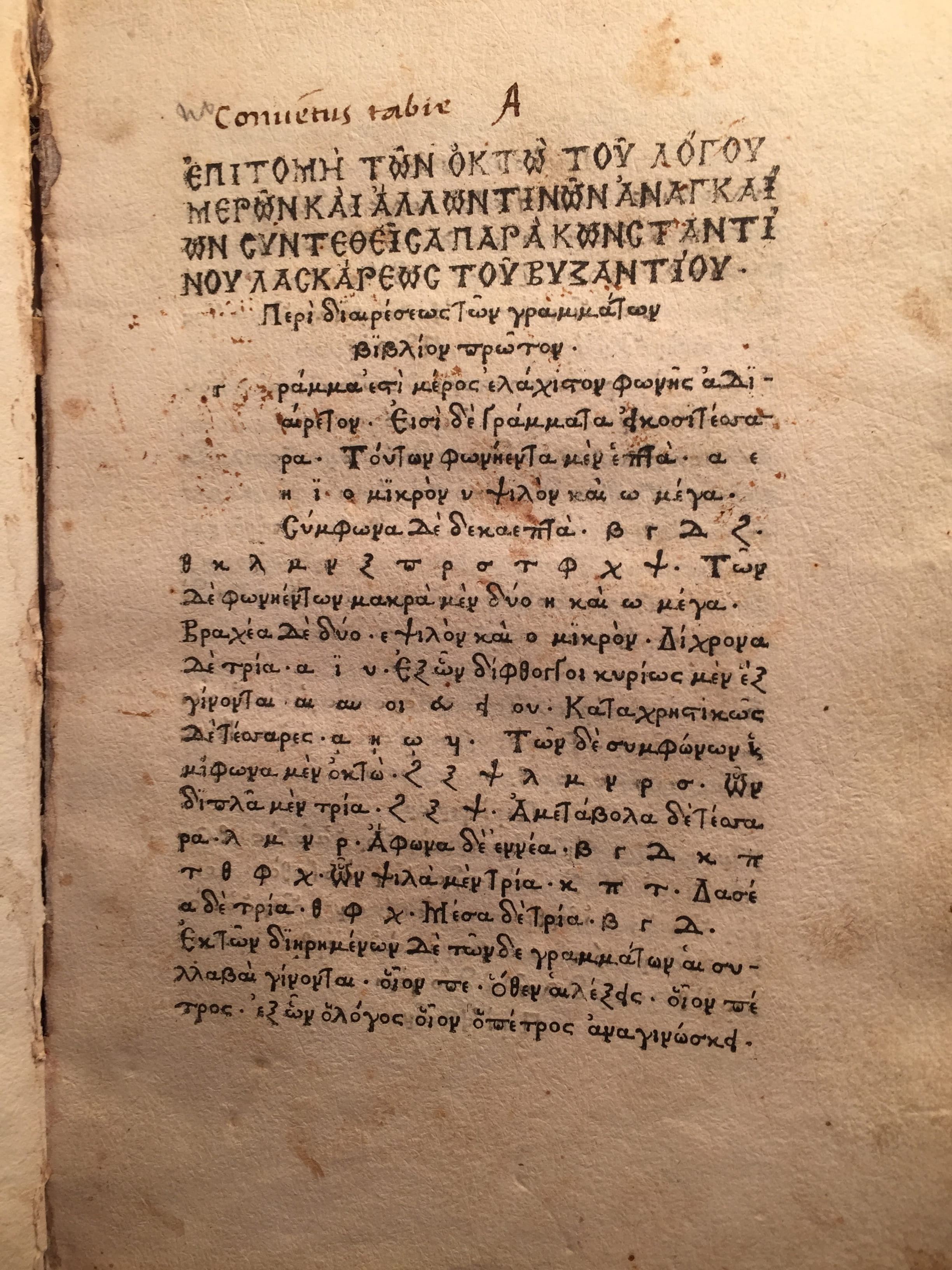
Printing, indeed even learning, Greek in this early period was further inflected by a certain amount of controversy. As Simon Goldhill has explored in Who Needs Greek?, learning Greek was initially met with resistance by certain clerics who perceived it as a threat to Christian Latinity. In the early sixteenth century, the monk Nicolaus Baecham went so far as to declare, in an attack on Erasmus’ new translation of the Greek New Testament, that Greek was “the font of all evil”[3] (Goldhill, 26). Erasmus himself was both a great champion of Greek studies and actively involved in the world of early Italian Greek print: a friend of Aldus, Erasmus spent many months at the Aldine Press in Venice perfecting his Greek and working on various scholarly Greek projects. According to Erasmus, the suspicion surrounding Greek (and even Hebrew) went beyond just reading the language or translating scripture. In his famous Letter to Martin Dorp, Erasmus mocks “certain individuals who pass for serious scholars” who “hastened to implore the printer, in the name of everything sacred, not to allow the insertion of a single world of Greek or Hebrew: these languages were fraught with immense danger and offered no advantage, and served only to satisfy men’s curiosity.”[4]
This anxiety Erasmus describes links the visual potency of simply representing the Greek alphabet on the page to an almost perverse voyeurism; seeing, not even reading, Greek is a prelude to disaster. And indeed, since the number of literate individuals who could read Greek in this period was tiny, viewing rather than comprehending would have been the more common form of readerly engagement. The visual design of Greek letters on the page, then, carried a particular significance: implicitly shaping how both readers and non-readers of Greek encounter the newly recovered language via a kind of extra-textual legibility.
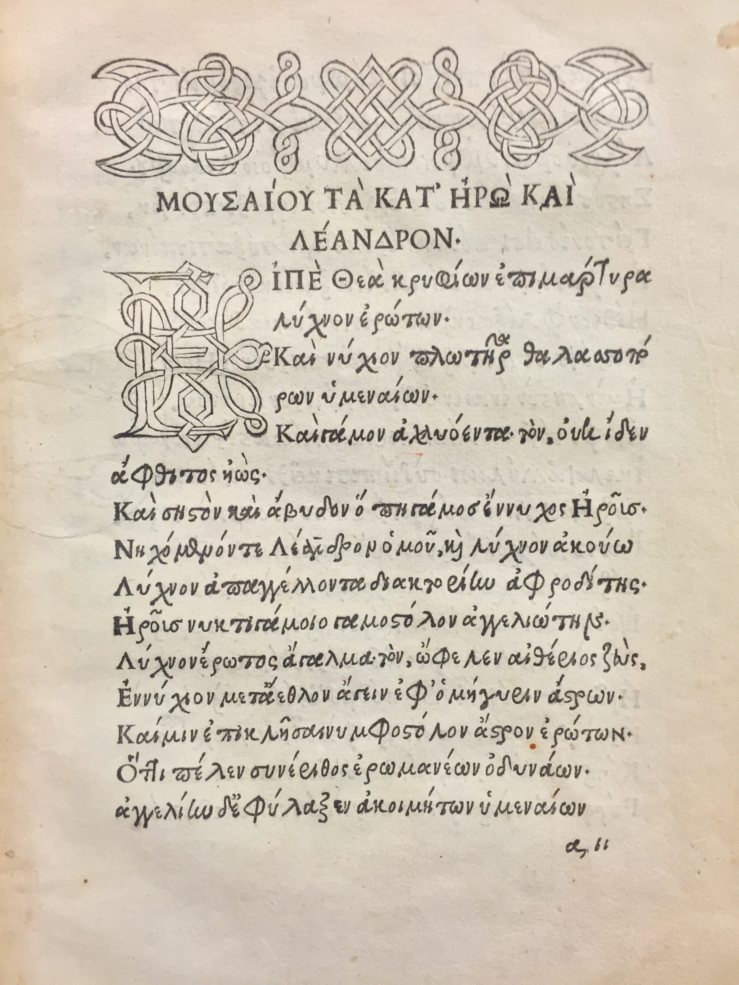
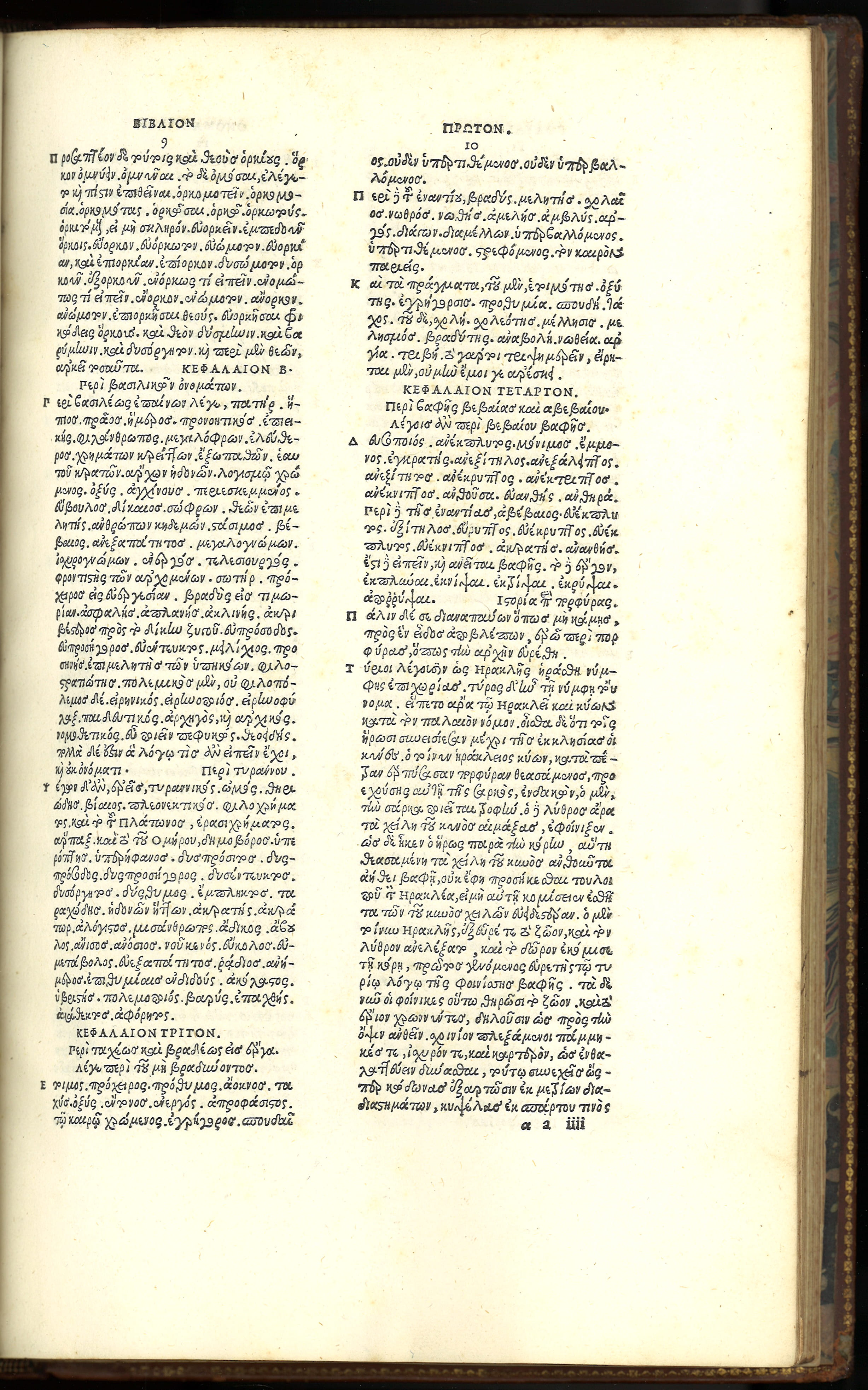
Aldus elected to base his type off of contemporary Greek handwriting, the “humanist hand” that the Byzantine scholars directly involved in the dissemination of Greek learning used themselves to copy Greek manuscripts. Accordingly, in his letter requesting a privilege to protect his new Greek type design (1495), Aldus specifically lauded the ability of his type to “print so well and so much better in Greek than can be written with a pen.”[5] In choosing handwriting as his model, however, Aldus ran into the problem of ligatures and abbreviations. As we can see in his earliest attempts to print Greek, such as his first stab at Hero and Leander (1494?), his type was replete with complicated conjoined letters and even more elaborate abbreviations that required (and still require) their own decipherment. While later Aldine Greek types reduced the number of these special characters, as we can see in his edition of Julius Pollux (1502), Aldine Greek texts needed an astonishing number of pieces of type in order to be printed.
An original alternative to Aldus’ design came from Lascaris, the prominent Byzantine scholar, who, in collaboration with the Florentine printer Lorenzo de Alopa, developed a Greek type that took not contemporary handwriting but rather ancient Greek inscriptions as its visual model. While this was not it and of itself so uncommon (Latin types had been using inscriptional letters for a few decades), what was exceptional was Lascaris’ choice to make the entire font uppercase inscriptional letters. In other words, Lascaris did not envision the lettering of ancient inscriptions as models primarily suited for titles or headings (as they were in Latin types), but rather as the most elegant and practical way to print entire works. Lascaris, therefore, designed his type to include both small and large uppercase letters and debuted this new type in the first edition of the Greek Anthology (1494). In the dedicatory epistle of his Greek Anthology, Lascaris justified his unorthodox choice by appealing to both the aesthetic dimensions of type design and the technical exigencies of cutting type:
Taking this new opportunity of printing, which will be so useful for students of literature, I set myself to rescue the elements of Greek letters from misshapen and really unbecoming corruption. When I thought of the letter-forms provided now for use in printing, which are not convenient for engraving and cannot be properly fitted to each other, I took all the more care to seek out the primary form of the letters [priscae literarum figurae], long out of use, and I provided a model for the printers adapted to the technical processes of printing by the engravers and craftsmen.[6]
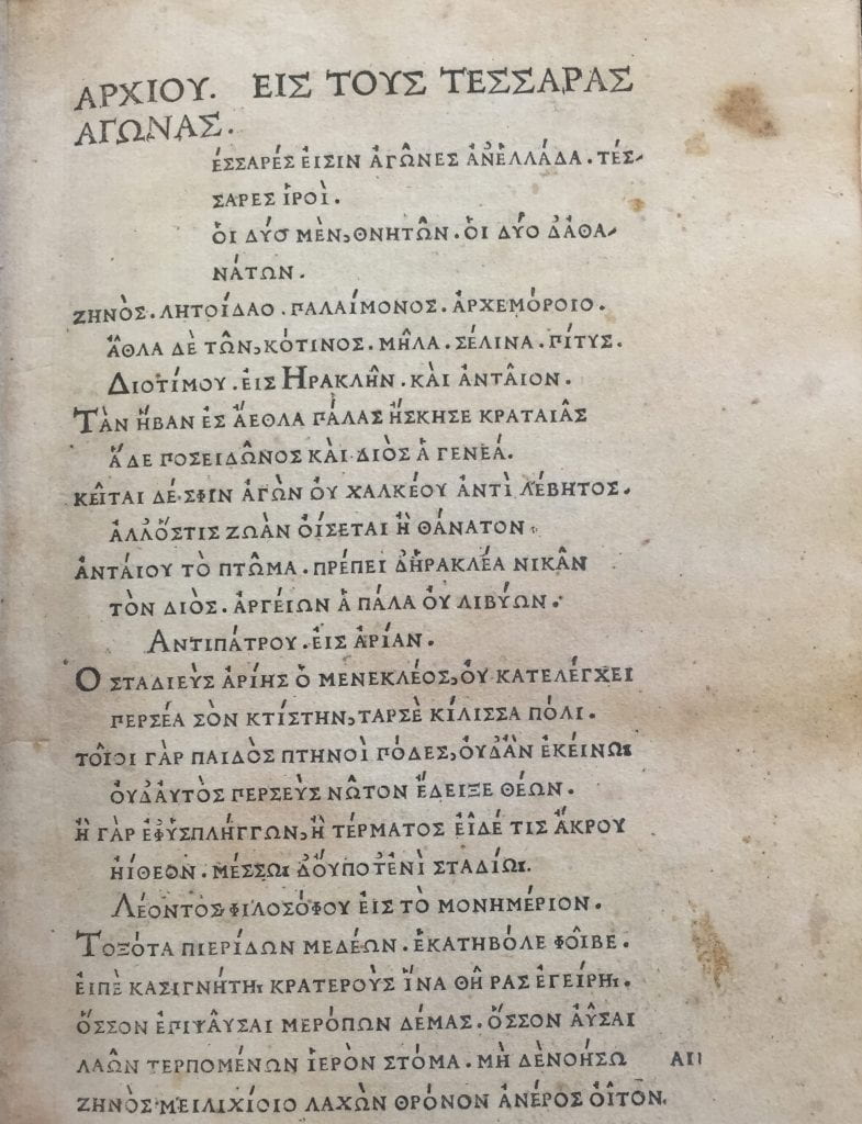
While Aldus celebrated the ability of his press to present Greek on the printed page in a way that exceeded the writing of a pen, Lascaris shifts the emphasis away from the solely visual and from the end product alone. He imagines print’s intervention in Greek cultural recovery to involve every step in the printing process, beginning with the engraving and cutting of type. Seen from this perspective, where the appearance of the page is only one dimension of what print means, the ancient practice of carving stone for inscriptions and the Renaissance practice of carving metal pieces to make type do indeed seem to be analogous material procedures. The abbreviations Aldus dutifully reproduced were also the product of a scribal culture where rapidly transcribing and recording information was essential, something print makes essentially irrelevant. Thus, while Lascaris’ typeface was unsurprisingly short-lived (he only printed six other texts in his all-capitals font), it reveals not merely the innovative energy that surrounded the early printing of Greek, but also the layers of legibility, of significatory possibility, understood to operate within the early Greek printed page.
Looking closely at the ways in which the earliest printers addressed these challenges, we can begin to understand how the material concerns of Greek print, from the sources used in the graphic design of the typefaces to the technical challenges of translating an alphabet from manuscript to moveable type, were themselves inflected by multiple material contexts, ones that stretched from the contemporary Hellenism of the fifteenth century back to Greek antiquity itself.
Jane Raisch is a doctoral student at Berkeley in the Department of Comparative Literature. She focuses on the reception of Greek in Early Modern English literature and the intersection between scholarship and poetics.
[1] Aldus Manutius, The Greek Classics, ed. and trans. Nigel Wilson (Cambridge, Mass.: Harvard University Press, 2016), 25.
[2] Richard Breaden, “The First Book Printed in Greek,” Bulletin of the New York Public Library. 51 (1947): 3.
[3] Erica Rummel, Erasmus and His Catholic Critics I, 1515-1522 (Nieuwkoop: De Graaf, 1989), 139. Also cited in: Simon Goldhill, Who Needs Greek?: Contests in the Cultural History of Hellenism (New York: Cambridge University Press, 2002), 26.
[4] Erasmus, “Letter to Martin Dorp,” in Praise of Folly, trans. Betty Radice (New York: Penguin Classics, 1985), 242.
[5] Nicholas Barker, Aldus Manutius and the development of Greek script & type in the fifteenth century (New York : Fordham University Press, 1992), 92.
[6] Barker, 39n21.
Further Reading:
Robert Proctor, The Printing of Greek in the Fifteenth Century. Oxford: Printed for the Bibliographical Society at the Oxford University Press, 1900.
Barker, Nicholas. Aldus Manutius and the development of Greek script & type in the fifteenth century. New York: Fordham University Press, 1992.
Simon Goldhill, Who Needs Greek?: Contests in the Cultural History of Hellenism (New York: Cambridge University Press, 2002).


August 30, 2016 at 10:00 am
As someone who has been translating 16th and 17th century Greek texts for the last couple decades, I wish more of them were in the Lascaris style. Those ligatures are awful!